

Packaging Basics
Offset or Digital Printing, and Which Finishes Are Worth Paying For
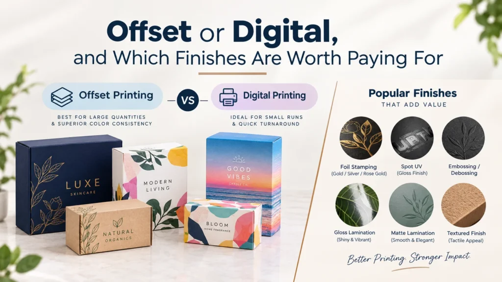
Every printing question on a packaging job comes back to a single mechanical fact. The question is whether your job needs printing plates or not, and everything else follows from the answer.
Offset printing uses plates, with one metal plate made per color and each plate produced for your specific artwork before it ever reaches the press. Digital printing uses no plates at all and works more like a very good office printer scaled up to press sheets. That one difference drives the cost, the quantity where each method makes sense, the color accuracy you can hold and how many versions you can run together.
This article covers when each method wins and how to tell which side of the line your job sits on. It then covers which finishes actually earn the money they cost, which matters more than most buyers expect. A badly chosen finish wastes more money than choosing the wrong press ever will.
Offset pays for itself above about 1,000 units
Making plates costs time and material before a single sheet prints. On a run of 200 boxes that plate cost is spread across 200 units and it dominates the price you see. On a run of 5,000 it disappears into the noise and barely registers.
The crossover sits at around 1,000 units on most jobs. Below that figure digital is usually cheaper, above it offset usually is, and the gap widens steadily as the quantity climbs. Offset also gives you two things that no digital press can match today. It holds a named Pantone spot color exactly, because the ink is mixed to that recipe rather than built from four process colors. It also runs on a far wider range of board stocks and weights.
Digital wins on short runs and on variants
Digital skips plates completely, so a job starts printing almost immediately and a second design costs no more to set up than the first one did.
That second point is the one most brands underuse on their first order. If you sell six scents, offset means six sets of plates, while digital means one file carrying six artworks in a single run. The unit price stays the same across all six of them. This is how most corporate gifting programs and flavor ranges actually get produced. It is also why a brand testing a new line should start on digital. You can put 100 boxes of each variant into the market and find out which one sells before committing plates to the winner.
| Offset | Digital | |
|---|---|---|
| Plates | One per color | None |
| Cost efficient | Above about 1,000 units | Below about 1,000 units |
| Pantone spot colors | Exact match | Simulated in process color |
| Several designs in one run | Each needs its own plates | No extra plate cost per variant |
| Board range | Almost anything we stock | Narrower, and some stocks are out |
| Best for | Volume on a settled design | Short runs, tests and variant ranges |
There is one thing to plan for on digital work before you get excited about variants. The minimum is still 100 boxes per size and per design. Digital removes the plate cost per variant and not the minimum itself, so eight client logos is eight lots of 100 rather than one lot of 800.
A worked example of where the crossover actually falls
The 1,000 unit figure is a rule of thumb rather than a law, and it moves depending on how many colors your design carries. Working through one example makes the pattern obvious enough to use.
Picture a straightforward four color design printed on coated white board. On offset you are paying for four plates plus four passes through the press, and that whole package is a fixed cost that happens once. Divide it across 300 boxes and it lands heavily on every unit. Divide the same package across 3,000 boxes and it becomes a rounding error next to the board and the ink.
Now change the design to two colors on kraft board. The fixed package halves because there are only two plates and two passes. Offset therefore becomes competitive at a lower quantity than it would on the four color job. This is why the crossover is a range rather than a number. A simple design pulls it down toward 600 or 700 units and a complex one pushes it past 1,200.
You do not need to calculate any of this yourself. Ask for both methods on one custom quote whenever your quantity sits near the middle. Seeing the two numbers side by side settles the question in seconds.
The board you choose can narrow the method for you
Buyers usually pick the printing method first and the board second. On some jobs that order causes a problem, because the board can rule out a press before the quantity has any say.
Coated white board is the easy case and both methods handle it beautifully. Uncoated stocks are where the two methods start to separate from each other. Natural kraft absorbs ink and darkens it, so a color that looked right on screen prints warmer and softer on brown board. Offset handles that absorption predictably and has done so for a century. Digital toner sits more on the surface of an uncoated sheet, which can leave solids looking patchy across a large panel.
Textured and specialty papers push that same point considerably further. Linen and felt and heavily laid surfaces are offset territory, because a digital press needs a flatter sheet to lay toner evenly. If your design depends on a specialty stock, assume offset and let the quantity be a secondary question. Every structure we cut is listed on the box styles page.
Pantone is how a color survives a reorder
If your brand lives on one specific color, this section matters more than the rest of the article put together.
A color built from CMYK is mixed on press from four inks. That mix shifts slightly between print runs, between board stocks and between coated and uncoated surfaces. Nobody notices the shift on a photograph of a product. Everybody notices it on a solid brand red when new stock sits on a shelf beside old stock.
A Pantone spot color is mixed to one published recipe before it reaches the press, so that color lands the same way on every run we print. Name it by number in your artwork file and we hold it across every reorder. The practical advice that follows from this point is simple enough to act on today. Name the one or two colors that carry your brand as Pantone numbers and let everything else build from process color. That gets you consistency where it counts without paying for spot color across the whole design.
Lead time is not the same on both methods
Plate making is a real step in the schedule and not just a line on the invoice. A digital job can move into production as soon as the proof is approved, while an offset job waits for plates to be produced first.
Our published window is 8 to 12 business days for folding cartons, counted from the day you approve the dieline and the proof. Digital work tends to sit at the earlier end of that window and offset at the later end, and finishing moves it further still. That difference rarely decides a job on its own, but it matters when a trade show or a seasonal launch sits behind the date.
Every finish adds a separate pass
A finish is not a setting somebody flips on a machine. Each one is another trip through another machine, which is exactly why finishes add cost in steps rather than smoothly.
| Finish | What it does | What it costs you |
|---|---|---|
| Gloss lamination | Adds shine and resists scuffing and moisture | One pass, the cheapest protective option |
| Matte lamination | Flattens shine and feels smoother | One pass, similar cost to gloss |
| Soft touch lamination | A velvet surface that changes how the box feels | One pass at a premium over matte |
| Spot UV | High gloss on selected areas over a matte base | One extra pass plus a separate file layer |
| Hot foil | Real metallic in gold, silver or color | One extra pass plus a foil die |
| Emboss or deboss | Raises or presses the board itself | One extra pass plus a sculpted die |
Two finishes means two extra passes and three finishes means three. The cost is not linear with how good the result looks, which is why one well chosen finish almost always beats three stacked on top of each other.
Which finish earns its money on which box
Here is where we would spend it, based on what customers actually reorder rather than on what looks best in a brochure.
On a folding carton that gets torn open in seconds, spend on lamination and stop there. Gloss or matte protects the print through the supply chain and keeps the box looking new on a shelf. Soft touch on a carton that lives for ten seconds is money nobody experienced.
On a rigid gift box, soft touch is worth every cent of the premium. The customer holds that box and often holds it for a while, and the surface is a large part of what makes the whole thing feel expensive.
For metallics, choose hot foil rather than metallic ink on any panel that matters. Metallic ink printed flat has almost no reflectivity and reads closer to mustard than to gold. Hot foil is actual metal leaf and it does what gold is supposed to do. Where foil does not fit the budget, spot UV over a matte base gives you a similar contrast effect for less money.
Use embossing only where the logo shape is bold and simple. Embossing works best on bold shapes that carry clear and uninterrupted edges. Fine detail and small type flatten out under the die, and you have then paid for tooling that nobody can actually read.
Some finishes fight with digital printing
This is the part of the subject that catches people out, because the two halves of the job are usually discussed separately. Printing method and finishing are chosen as if they were independent, and on a few combinations they are not.
Digital toner sits on the surface of the sheet rather than soaking into it the way offset ink does. Anything you then apply over that toner has to bond to it. Foil over a heavy digital toner area can lift, and spot UV over certain toners adheres unevenly. Neither problem is universal and neither is a reason to avoid digital. Both are a reason to name the finish you want at quotation stage rather than after the boxes are printed.
The fix is almost always simple once the problem is known early enough. We keep foil and spot UV off heavy toner coverage, or we move that element onto bare board where it bonds cleanly. Where the finish is the whole point of the design, we move the job to offset instead. What we cannot do is solve any of it after a run has printed.
Inside printing is the cheapest upgrade on the list
Most finishing decisions are about the outside of the box, which is the surface a shopper judges. The inside is the surface a customer sees at the one moment they are paying full attention, which is when the box opens.
On digital printing an inside print costs very little because no extra plates are involved, and on offset it costs one more pass. Either way it buys a reaction out of all proportion to the money. It works hardest on ecommerce mailer boxes, where somebody is opening the box alone at home. A pattern or a short message or a simple color block all do the job.
Two rules that stop most reprints
Keep positive type at 6 pt or larger and reversed type at 8 pt or larger. Reversed type fills in at small sizes because ink spreads slightly on board, and what looked sharp on a screen turns into a smudge on the shelf.
Keep every line weight in the file at 0.25 pt or above. Anything finer breaks up during printing, and it breaks up worst on uncoated or kraft stock where the surface is more absorbent.
Check these before you approve the proof
Approval is the point where responsibility moves to you, so it is worth five minutes rather than five seconds. Run down this list carefully before you reply to us.
- Every Pantone you need held is named by number in the file rather than built from CMYK
- The finish you expect is written on the proof, including which panels carry spot UV or foil
- Spot UV and foil areas sit on their own layer so there is no guessing about coverage
- Barcodes are checked against your own product database rather than assumed correct
- Type is 6 pt or larger positive and 8 pt or larger reversed
- Regulatory text, weights and ingredient panels have been read by someone who owns them
- The dieline shows the structure you actually ordered, including any window or hang tab
An error that was visible on an approved proof becomes a reprint at your cost. That is the single strongest argument for ordering a printed sample on any job carrying legal or regulatory content.
What to send us
Tell us the quantity and whether you need one design or several. Then tell us which colors have to match exactly and which finish you have in mind. Those four answers decide offset or digital, whether you need spot color, and whether the finish and the press will get along.
Artwork comes to us as an AI, EPS or PDF file in CMYK at 300 dpi with 3 mm of bleed on every edge. Design support is free at every stage, so if the file is not print ready we will fix it rather than send it back to you.
The minimum is 100 boxes per size and per design and the price break lands at 1,000 units on the same artwork. There is no setup or tooling charge at any quantity. A plain structural sample takes 3 to 5 working days and a printed sample takes 7 to 10. You hold the actual box before the full run starts. That remains the only reliable way to judge a finish before committing to a full run.
Email Sales@boxesexpert.com or start a quote request and we will price both printing methods whenever your quantity sits near the crossover.
