
Artwork Guidelines
Use the following guidelines while preparing your artwork. If you’re unsure, kindly contact our design team and we will explain what needs adjusting.
Preparing artwork in four steps
Ask us for the template
Send your internal dimensions and the quantity and we cut a dieline to your product. Every line on it is color coded and the next section explains what each color means.
Design on the template
Place your brand artwork on the layer above the dieline. Keep the dieline layer exactly where it is because moving or scaling it puts the print out of register with the die.
Check color, fonts and resolution
Work in CMYK, name your Pantone colors by number, convert type to curves and keep images at 300 dpi at final size. Those four checks catch most of the files we have to send back.
Send it and approve the proof
You get a flat proof and a 3D view before anything goes to press. Print the flat proof at actual size and fold a paper dummy because that tells you more about fit than a screen ever will.
What the colored lines on your template mean
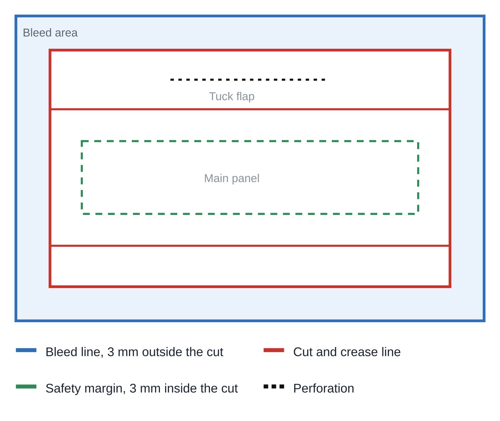
- Cut and crease line, red. The outer red line is where the blade trims the sheet. The inner red lines are creases where the box folds, so keep heavy artwork off them because it can crack along the fold.
- Bleed line, blue. It sits 0.125 in, or 3 mm, outside the cut line. Run every background and image all the way out to this blue line rather than stopping at the cut line, because that is what stops a white sliver appearing when the blade shifts.
- Safety margin, green. It sits 0.125 in, or 3 mm, inside the cut line. Keep all text and logos inside it so nothing is trimmed off on a normal cutting tolerance.
- Perforation, dotted black. A punched line of small holes that lets a panel tear cleanly by hand. Perforation is for tearing and folding is handled by the crease lines instead.
File formats we accept
You can send native design files or a press ready PDF. Vector art gives the cleanest result because it holds its edge at any size.
- Adobe Illustrator
- Adobe InDesign
- CorelDraw
- EPS or press ready PDF
- Adobe Photoshop, but only where the design is genuinely photographic
Photoshop sits last on that list for a good reason. A logo or a block of type built in Photoshop is made of pixels and it softens on press. The same artwork drawn in Illustrator stays sharp at whatever size we print it.
Creating your artwork
Place your brand artwork on the template we send and return it to us for proofing. Keep the dieline on its own layer and leave it exactly where it is. Put any white ink on a separate layer named White and set it to overprint so we can hold it as its own plate.
Any image you embed needs to be 300 dpi at the size it prints rather than at the size of the original file. An image at 300 dpi scaled up to 200 percent on the page is a 150 dpi image by the time it reaches the plate. Send us vector art instead wherever you already have it.
Color management
Design your artwork in CMYK colors (standard for printing all over the world). If the file is in RGB (most design software use this) then convert it into CMYK. If you have an important brand color then share the pantone reference of that color or send us the printed samples.
Name every Pantone you care about by its number in the file. That is the only reliable way to hold a specific color across a reorder. A four color build of the same shade drifts between runs and between board stocks.
Do not judge your color from a PDF on a screen. A monitor emits light while ink sits on board and absorbs it so the two never match. Send us a printed sample or a physical color reference if you have one and our design team will match to that instead.
Fonts
Convert all type to curves before you send the file. That is the one step that guarantees your text looks the same on our machines as it does on yours. Send the font files separately along with the artwork if you need us to keep the text editable.
Page size and proofing
Set your artwork up as a single page at the same size as the template we send you. Our team handles imposition so you do not need to lay out multiple copies on a sheet.
Before approval attach the proof at 100% scale and fold it along the marked lines. Make sure that the front, back and side panels face the right way. Also confirm the text is positioned perfectly.
Full specification
| Item | What we need |
|---|---|
| Cut and crease line | Red. The outer red line is the trim. The inner red lines are creases where the box folds. |
| Bleed line | Blue, 0.125 in or 3 mm outside the cut line. Every background and image runs out to it. |
| Safety margin | Green, 0.125 in or 3 mm inside the cut line. All text and logos stay inside it. |
| Perforation | Dotted black. A punched line of small holes so the panel tears cleanly by hand. |
| File formats | Illustrator, InDesign, CorelDraw, EPS or press ready PDF. Photoshop only when the design is genuinely photographic. |
| Color mode | CMYK for the whole document. Never send RGB, because it shifts on conversion. |
| Spot colors | Name every Pantone by number in the file rather than leaving it as a four color build. |
| White ink | On its own layer, named White, set to overprint. Do not merge it into the artwork. |
| Images | 300 dpi at final printed size, or supply vector art instead. |
| Fonts | Converted to curves. Send the font files separately only if you need us to edit live text. |
| Rich black | C40 M30 Y30 K100 for large solids. Use 100 percent K on its own for small text. |
| Type and lines | 6 pt minimum positive type, 8 pt minimum reversed, 0.25 pt minimum line weight. |
| Page setup | One page at the same size as the template we send. Our team handles imposition. |
| Template | Build on the template we supply. Do not move, scale or flatten the dieline layer. |
Not sure whether your file is ready for press? Email it to Sales@boxesexpert.com and we will check it and share you the exact details which needs changing. Design support is free at every stage whether we are setting your own file onto our template or building the artwork from scratch.